Improved Rebuy's buying funnel with 60% more checkout completion
reBuy reCommerce GmbH
www.rebuy.de/verkaufen

Many customers who want to sell their old phones on rebuy are frustrated by the outdated and inconvenient grading process. They have to answer a long list of questions about the condition of their device, and then wait for a confirmation email with a price offer. If they accept the offer, they have to ship their phone to rebuy and wait for another email to confirm that the phone matches the description. This process can take several days or even weeks, and sometimes the offer is lower than expected or rejected altogether.

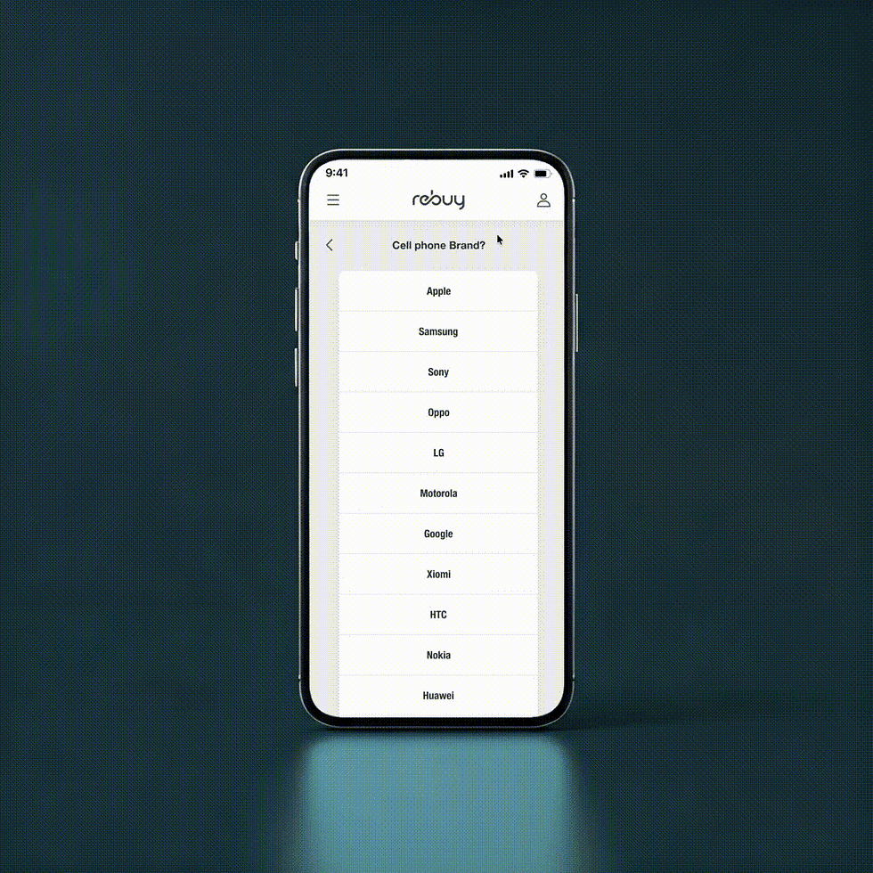
In our sales portal, user assess the condition of their product and receive an initial price offer. Then send it to Rebuy. However we saw many users dont complete the assessment funnel because of the inconvinient process.

The product gets throrough inspection and reviewed by professionals at Rebuy

After the evaluation the user gets payed
The solution that the previous designers came up with for the iPhone process was somewhat better than the old one, but it had a major drawback: it was not scalable. This means that it would not work well for any other consumer electronics, and it would require a lot of manual adjustments and maintenance. A scalable solution is one that can adapt to changing needs and demands, and that can handle growth and diversity without compromising quality or efficiency.

Empathising with customers
rebuy offers the its user to sell their old phones or consumer electronics directly on their website. This domain can be accessed as Verkaufen. One of the main drawbacks of selling phones on rebuy is the inconvenient grading process that determines the price of your device. Unlike other platforms that allow you to set your own price or negotiate with buyers, rebuy requires you to answer a series of questions about the condition and functionality of your phone, and then sends you a prepaid shipping label to mail it to their warehouse. There, they inspect your phone and assign it a grade, which affects how much they will pay you for it. This process can take up to two weeks, and you have no control over the outcome.
To gain a deeper understanding of our target customers, we conducted a series of user interviews and analysed their behaviour, needs and pain points. We used a semi-structured interview guide to explore their goals, motivations, challenges and preferences in relation to our Verkaufen domain. We also observed how they interacted with our prototype and asked them to provide feedback on the usability, functionality and desirability of our process. We then synthesized the data from the interviews and identified the key themes and insights that emerged from our analysis.

Timeline for the scope
Our team was given a challenging task to conduct a comprehensive user experience research, design and prototype in order to improve this funnel, test it with real users, and develop the final version, all within three months. The goal was to launch before Black-Friday sale starts.
This required us to work efficiently, collaboratively, and creatively, while following the best practices and standards of our industry. We started by defining the problem, the target audience, and the goals of the project. Then we conducted a thorough user research, competitive analysis, and user interviews to understand the needs, preferences, and pain points of our customers.

UX Interviews
We conducted a user experience (UX) interview with 8 participants who had used our Verkaufen domain in the past. The purpose of the interview was to understand how the users perceived the value, usability, and satisfaction, and to identify any pain points or improvement opportunities.
The participants were selected based on their frequency and history of selling their devices, as well as their demographic and behavioural characteristics. We aimed to have a diverse and representative sample of our target user segments. The participants ranged in age from 20 to 55, with an equal gender distribution. They also had different levels of familiarity and loyalty with our brand, and different shopping preferences and habits.
The feedback session consisted of a semi-structured interview, followed by a task-based usability test. The interview questions focused on the users' motivations, expectations, and experiences of selling their devices, as well as their suggestions for improvement. The interview involved asking the users to complete a series of tasks related to finding, selecting, and grading their own devices as detailed as possible. We observed and recorded the users' actions, comments, and emotions during the interview, and asked them to rate their satisfaction and ease of use after each task.

Analyse the findings...
We gathered this diverse set of information to ensure they had a comprehensive understanding of the problem they were facing and the factors influencing it. By synthesizing the data and insights from various sources and stakeholders, we were able to visualize the overall situation on our whiteboard. This helped us to gain a deeper understanding of the problem and the possible solutions.
Visualizing the data on the whiteboard made it easier to identify the user pain points, product need, and areas of concern. It facilitated discussions among team members, enabling us to collaborate and share different perspectives. This deeper understanding of the problem and the underlying factors helped us to develop more informed and effective solutions to address the challenges we were facing.

Competitor analysis
Rebuy offers a platform for buying and selling used cellphones. It aims to provide a convenient, fast and secure service for both buyers and sellers, as well as to reduce electronic waste and promote sustainability. Rebuy faces competition from several other players in the market, such as:
Swappie verifies the condition and functionality of each device before listing it, and provides buyer protection and customer support. it's main advantage is its low prices and high transparency, but its main drawback is its limited inventory and availability in certain regions.
Backmarket is a British company that buys used cellphones from consumers and resells them on its website. They offers free shipping, instant quotes and payment, and a 30-day return policy. It's main advantage is its simplicity and convenience, but its main drawback is its low offers and strict criteria for accepting devices.
Refurbed also buys and sells used cellphones, as well as other electronics, media and games. It offers free shipping, instant valuation and payment, and a 12-month warranty on all devices. It's main advantage is its wide range of products and services, but its main drawback is its low quality and customer satisfaction ratings.
Another factor that affects the old cell phone market is the exchange programs offered by some of the major smartphone manufacturers, such as Apple and Samsung. These programs allow customers to trade in their old devices for a discount on a new one, thus reducing the supply of old phones available for resale. This could pose a challenge for the old cell phone market, as it competes with other platforms that buy and sell used phones.

Value proposition
Rebuy can differentiate itself from these competitors by focusing on its unique value proposition, which is to offer a hassle-free, eco-friendly and trustworthy platform for buying and selling used cellphones. Rebuy can leverage its strong brand recognition, customer loyalty and social responsibility to attract and retain customers who care about the environment and quality of service. Rebuy can also improve its competitive edge by expanding its product selection, offering more payment options, enhancing its customer support and increasing its marketing efforts.

Improving the funnel
One of the ways to improve the rebuy selling old phone process is to provide clear and accurate information about the condition and value of the phone. This can help customers make informed decisions and avoid disappointment or frustration. Besides that, offering incentives such as discounts, coupons, or free shipping can encourage customers to choose rebuy over other options. Finally, ensuring a fast and secure delivery of the payment and the receipt of the old phone can increase customer satisfaction and loyalty.
Additionally, our objective was to offer users a complete cycle, wherein they could not only sell their old phones but also utilize the proceeds to purchase another phone from our rebuy platform.
The selling and grading process of cell phones involves several steps, such as evaluating the condition and functionality of the device, determining its market value. Each step requires careful attention and expertise to ensure a smooth and satisfactory outcome for both parties. However, there are also many challenges and difficulties that can arise during the process, such as:
-
Inaccurate or inconsistent grading standards that can lead to disputes or dissatisfaction
-
Lack of transparency or trust between buyers and sellers that can result in fraud or scams
-
Time-consuming or complicated procedures that can cause delays or inconvenience for the participants
To address these issues and improve the selling and grading process of cell phones, we tested few hypothesis (possible solutions) that can be implemented, such as:
-
making grading process standardised as per the industry
-
keeping user aware with all the steps and educate it’s significance
-
categorising the grading process into understandable steps
-
showing estimated value on every steps so the final offer doesn't comes with a big surprise

Redesigning the funnel
We aimed to improve the user experience and visual aesthetics of the selling process. We started with refining and iterating on the initial wireframe sketches to address any identified usability issues and align the design more closely with the project's goals and user needs.
During this stage, we work closely with stakeholders to gather feedback and insights, ensuring that all requirements are met. By incorporating user feedback, industry best practices, and creative design elements, the wireframes are transformed into a more polished and intuitive representation of the final output.
We prioritise the user experience on mobile devices over other platforms. It means that the website or app is created with the smallest screen size and the most limited features in mind, and then progressively enhanced for larger and more capable devices. This approach ensures that the core functionality and content are accessible to all users, regardless of their device or network speed. Mobile first also helped us to optimise the performance, usability and accessibility of the website or app, as it avoids unnecessary complexity and overhead that can slow down or frustrate the users. By designing for mobile first, developers can deliver a better and more consistent experience across different devices and platforms.

1. Streamlined Steps
I reduced the number of steps by combining related information. Device and condition details were merged into one simple process with clear labels and grouped fields. This cut down unnecessary clicks and kept users moving forward.
2. Simplified Forms and Error Handling
I redesigned form fields to be more intuitive, with inline validation that immediately showed errors next to the relevant input. This prevented users from submitting incomplete or incorrect information and having to backtrack. Also allowed user to change their answer when need, which lead to reduced abandonment and more completion.
3. Clear Price Indicators
The price offer shown to user as soon as they choose the device and the price changes as the conditions are added. Adding this in progress bar at the bottom of the funnel gave users a visual cue of how each action is reflected. This small change reduced anxiety and encouraged completion among most of the user.
Results & Impacts
After launching the redesigned funnel, Rebuy.de saw a 60% increase in checkout completion rates within two months. Key metrics improved:
-
Cart abandonment rate dropped by 26%
-
Average time to complete checkout decreased by 50%
-
Customer satisfaction scores related to checkout experience rose significantly
These results proved that focusing on user clarity and concise design can directly boost conversion rates.


Key takeaways...
This case study reinforced several important lessons for us:
-
Simplify before adding features. Removing unnecessary steps helped users focus on the goal.
-
Visual cues matter. Progress indicators reduce uncertainty and keep users engaged.
-
Immediate feedback prevents frustration. Inline validation helps users fix errors quickly.
-
Keep distractions for later. Upsells work better after the main purpose is complete.
These principles apply beyond Rebuy.de and can improve any buying funnel.
Moving Forward...
For the next steps, the company has strategically decided to retain the funds within its ecosystem, allowing users to utilise this money to purchase any product available on the Rebuy platform. This approach not only enhances user engagement but also fosters a sense of community and loyalty among customers.
By keeping the funds circulating at 100%, the company aims to create a vibrant marketplace where users can freely exchange their retained money for a diverse range of products, thereby maximising their purchasing power and ensuring that the money remains within the platform. This initiative is expected to stimulate sales and encourage repeat transactions, ultimately contributing to the overall growth and sustainability of the Rebuy platform.
Nonetheless, that is a different case study. Feel free to contact me for more information. Thank you for your attention!